Elements of Style:
Grammar Book Design
Introduction
Project Scope
Large scale design project split into two phases.
Given the text for the grammar manual, William Strunk Jr.'s "The Elements of Style", designers were individually tasked with designing, from plain text, a section of the book. In the second phase of this project, teams of three designers collaborated to create a unified series of booklets, completing the set, as well as an accompanying style guide.
Given the text for the grammar manual, William Strunk Jr.'s "The Elements of Style", designers were individually tasked with designing, from plain text, a section of the book. In the second phase of this project, teams of three designers collaborated to create a unified series of booklets, completing the set, as well as an accompanying style guide.
Year: 2025
Part 1 Development Time: 3 weeks
Deliverables:
- Printed 18 page booklet - Digital copy
Part 2 Development Time: 2 weeks
Deliverables:
- Three printed booklets in series - Companion Design and Style Guide
- Digital copies
Phase One
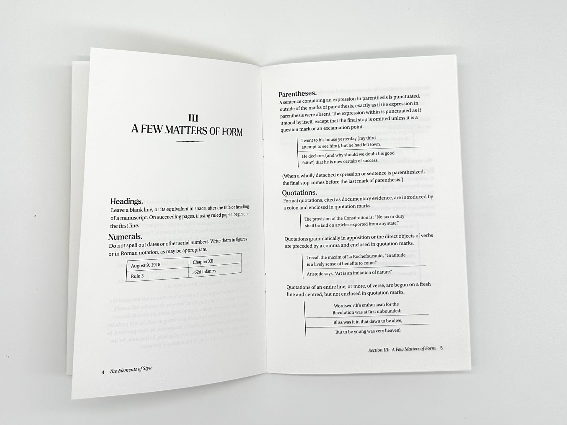
Creating a workable styled adaptation of Strunk's text posed some fun and interesting challenges. I chose the serif typeface Spectral for body text for it's legibility at small sizes and character, maintaining a scholarly tone fit for a book on grammar first published in 1918. The header type Articulat CF was chosen for it's synergistic semibold weight, complimenting Spectral as well as adding the legibility and simplicity of the Swiss International style of graphic design. Tables and examples were styled similarly, emphasizing their difference with a slight indent and left aligned bar, complimenting the Articulat CF's simple geometry.
Left:
Excerpt from the plain text given for designers to style
Excerpt from the plain text given for designers to style
Right:
Styled design ready for print
Styled design ready for print
Phase Two
Working with two other designers, each bringing different styles, fonts and interpretations of books to the table posed a challenge. Unifying one, collectively agreed upon style for all four printed booklets created the need to compromise on clashing ideas. The style guide was created to outline and describe all aspects of design within the three grammar booklets. Each page of the style guide describes the exact specifications and measurements one would need to create another book in this series styled identically to the others.
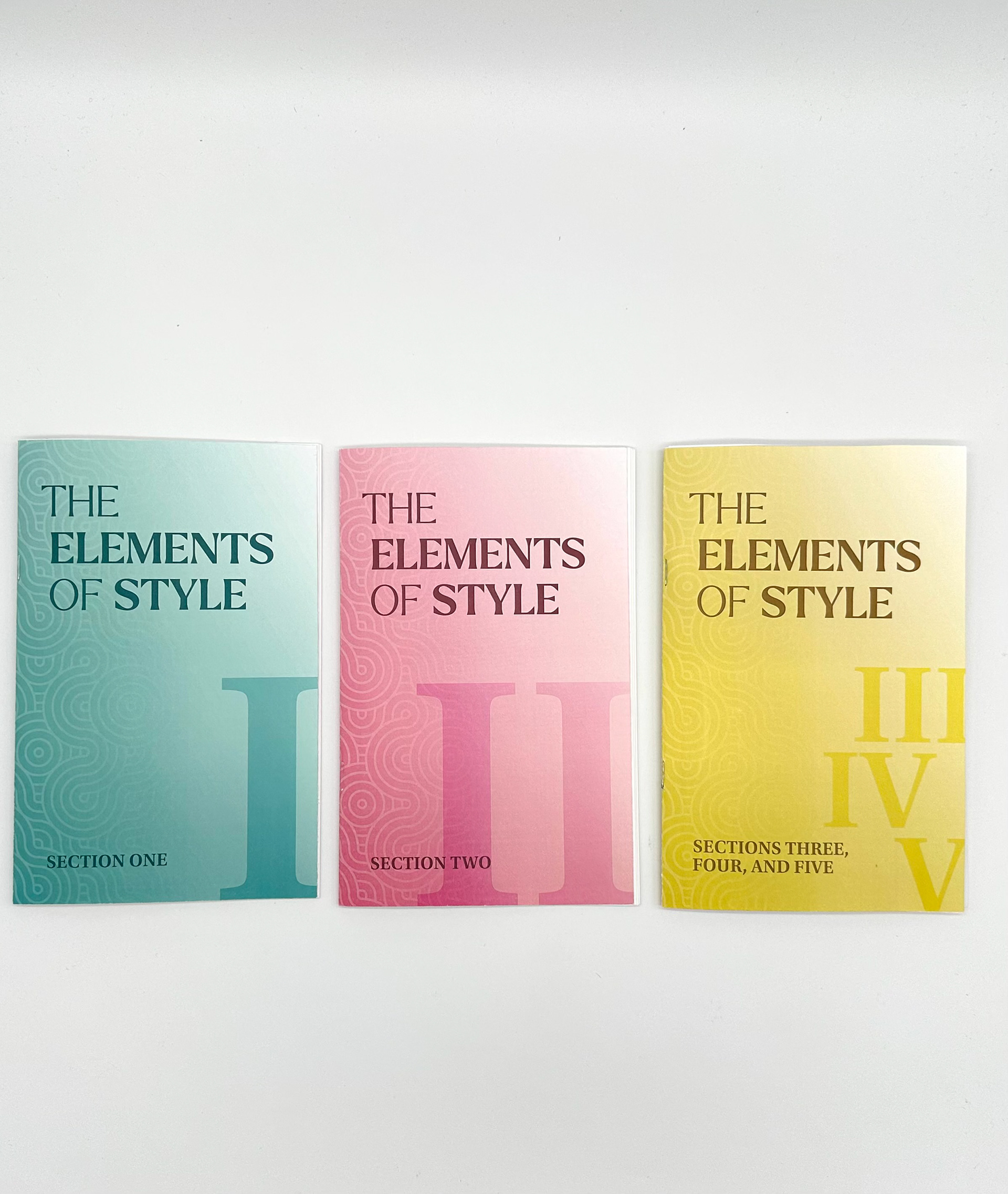
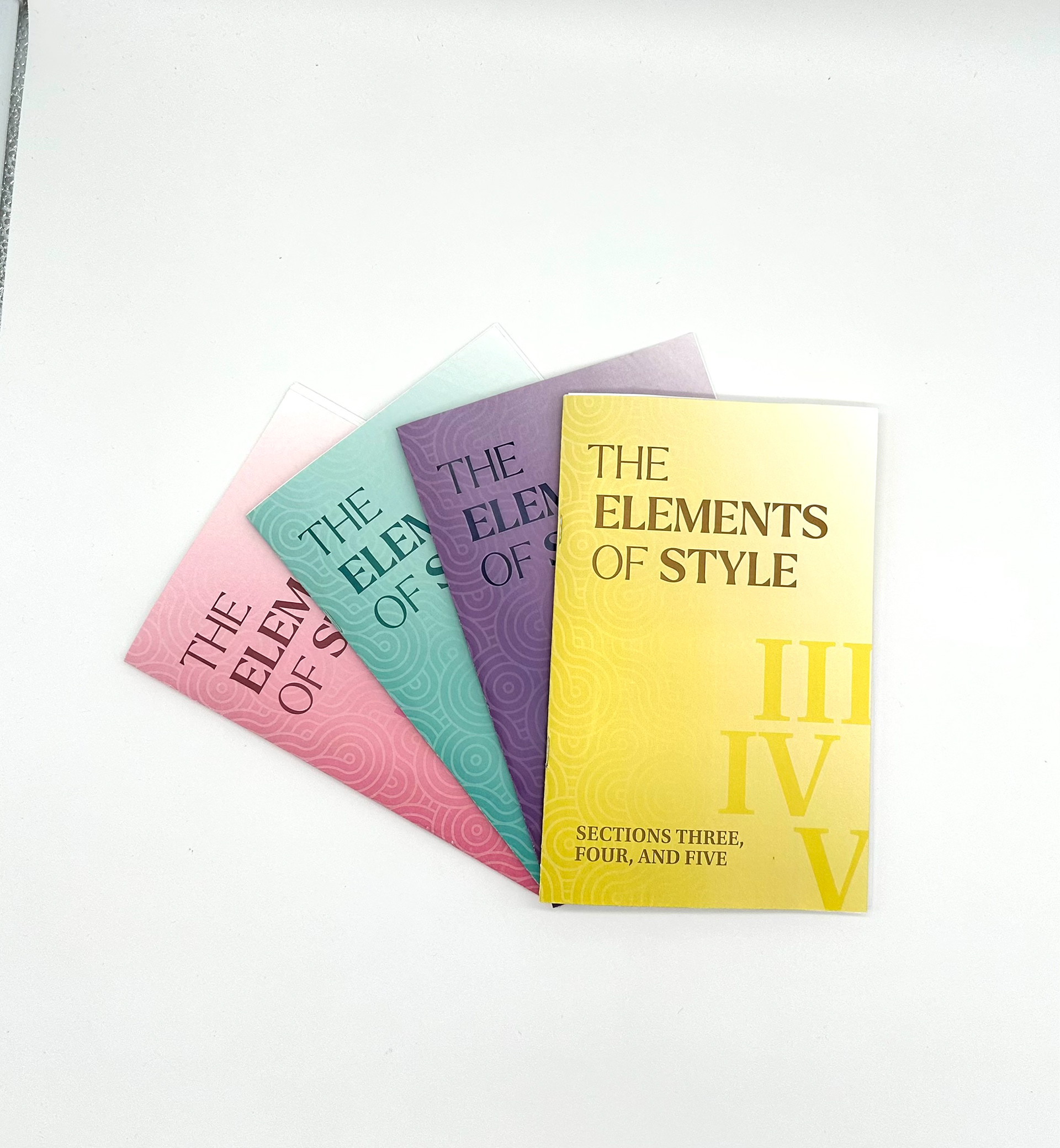
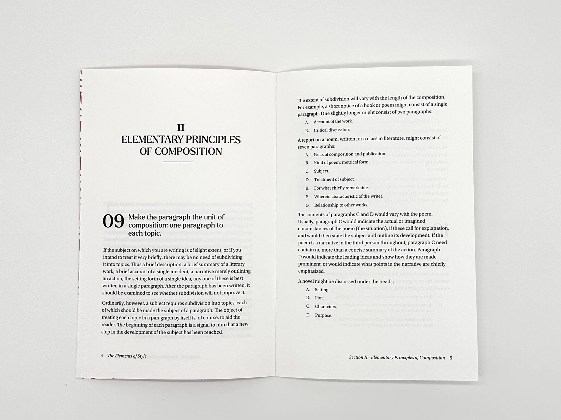
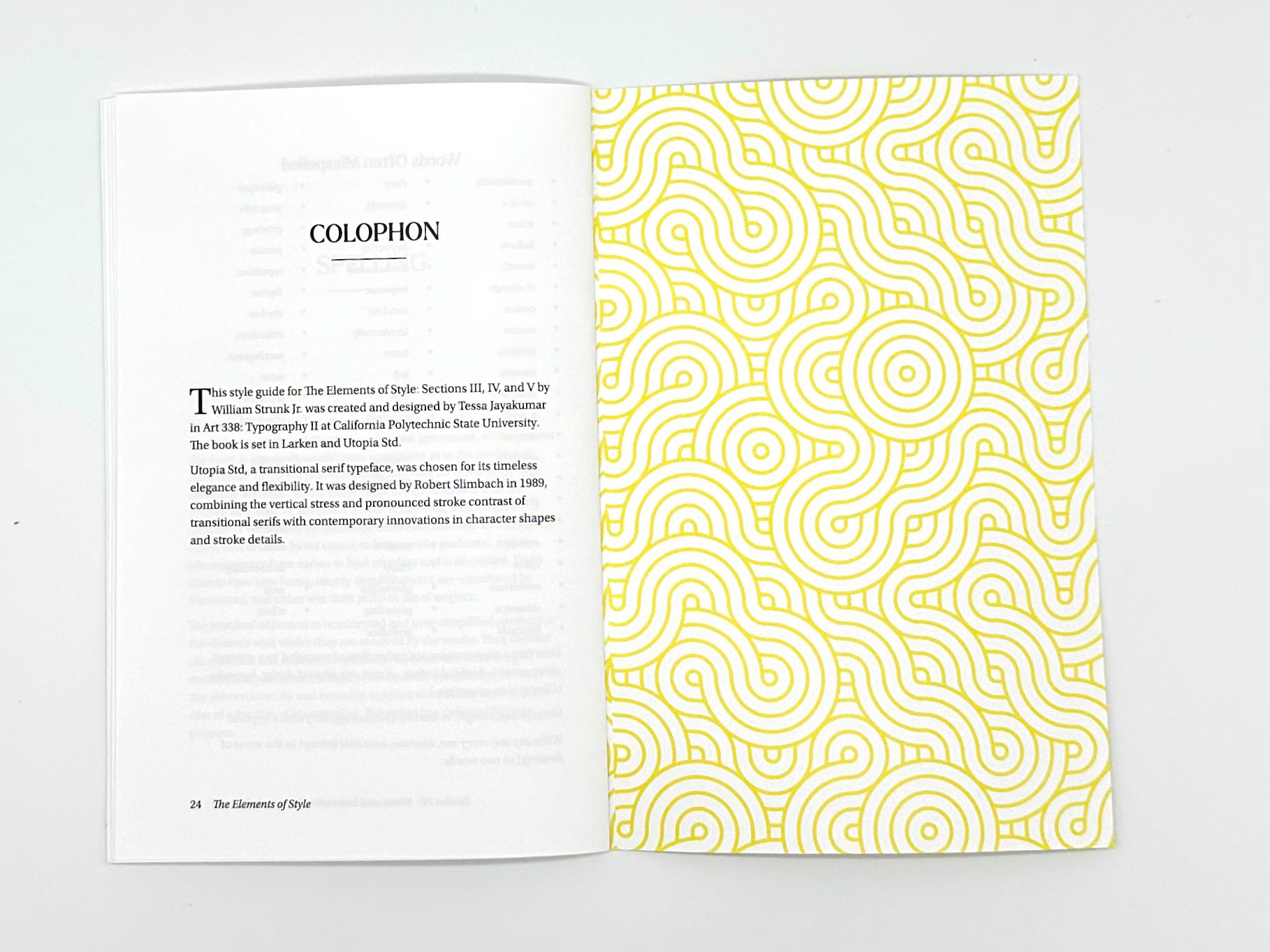
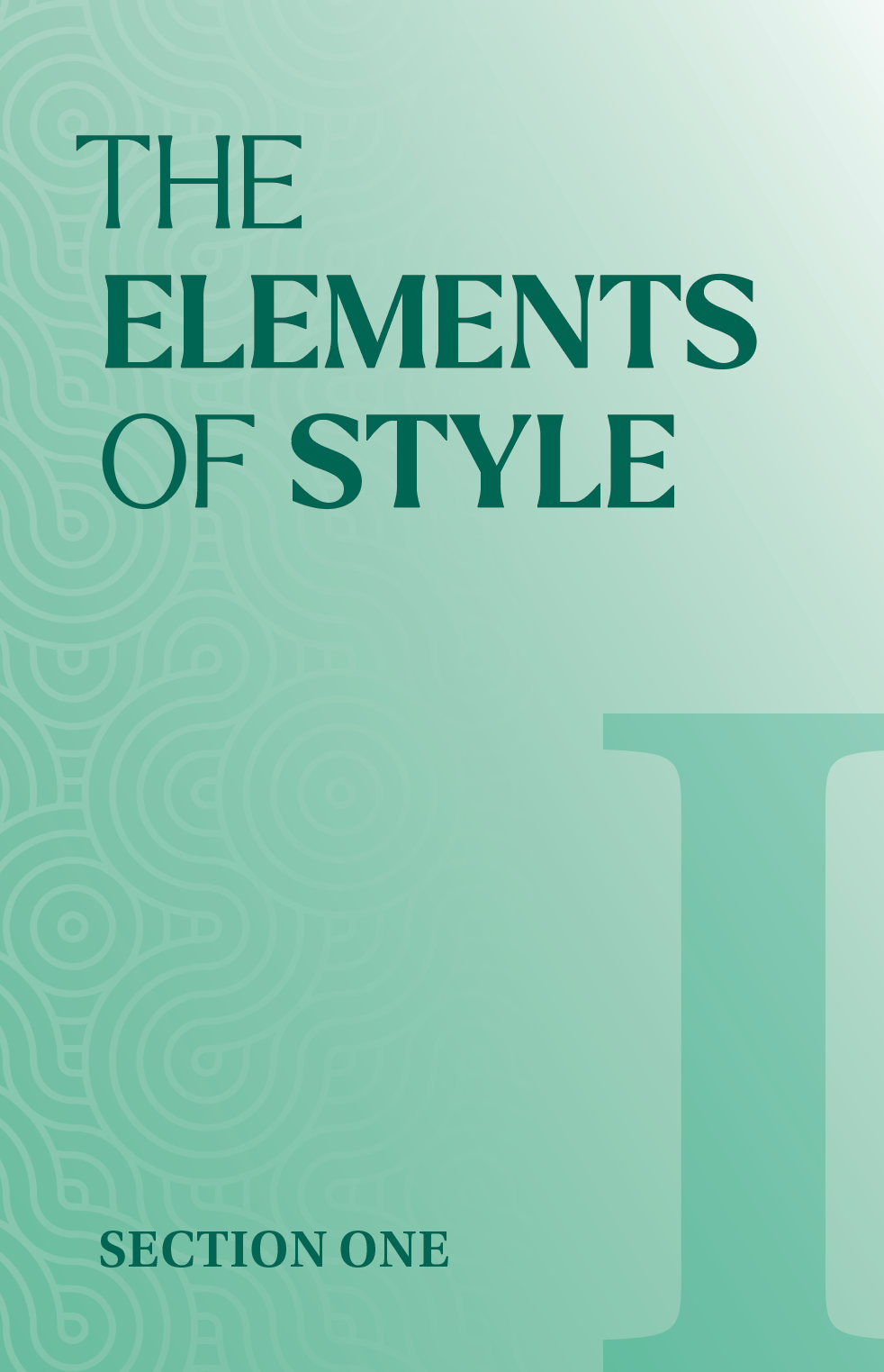
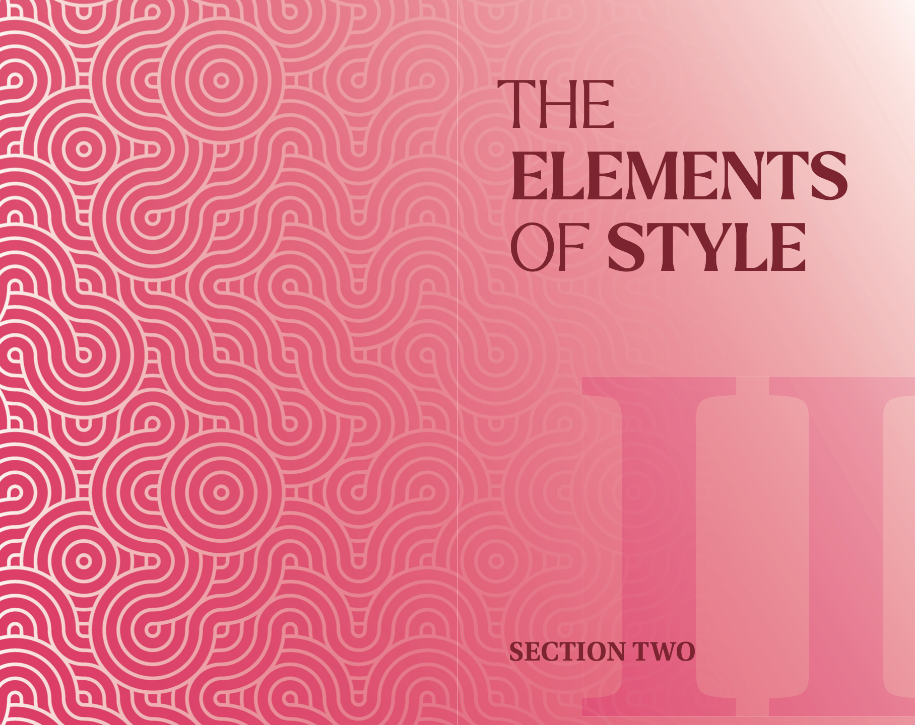
The three final booklets were restyled in accordance with our newly created style guide's rules and specifications. A unified series of covers was created which linked all books into a thematic framework. The typeface, Utopia was chosen for its sharp serifs and ample spacing. Keeping the books' topics in mind, this typeface emphasizes clarity and a smooth reading experience, perfect for conveying precise linguistic concepts. The typeface
Larken was chosen for the header text to create a classic yet modern design feel for the series of books.
Larken was chosen for the header text to create a classic yet modern design feel for the series of books.
Excerpt from Book 1
Excerpt from Book 2
Final Elements of Style Cover Designs


Large scale design project split into two phases.
Given the text for the grammar manual, William Strunk Jr.'s "The Elements of Style", designers were individually tasked with designing, from plain text, a section of the book. In the second phase of this project, teams of three designers collaborated to create a unified series of booklets, completing the set, as well as an accompanying style guide.
Given the text for the grammar manual, William Strunk Jr.'s "The Elements of Style", designers were individually tasked with designing, from plain text, a section of the book. In the second phase of this project, teams of three designers collaborated to create a unified series of booklets, completing the set, as well as an accompanying style guide.
