WeChef Full Company Brand Development and Mobile Application
Introduction
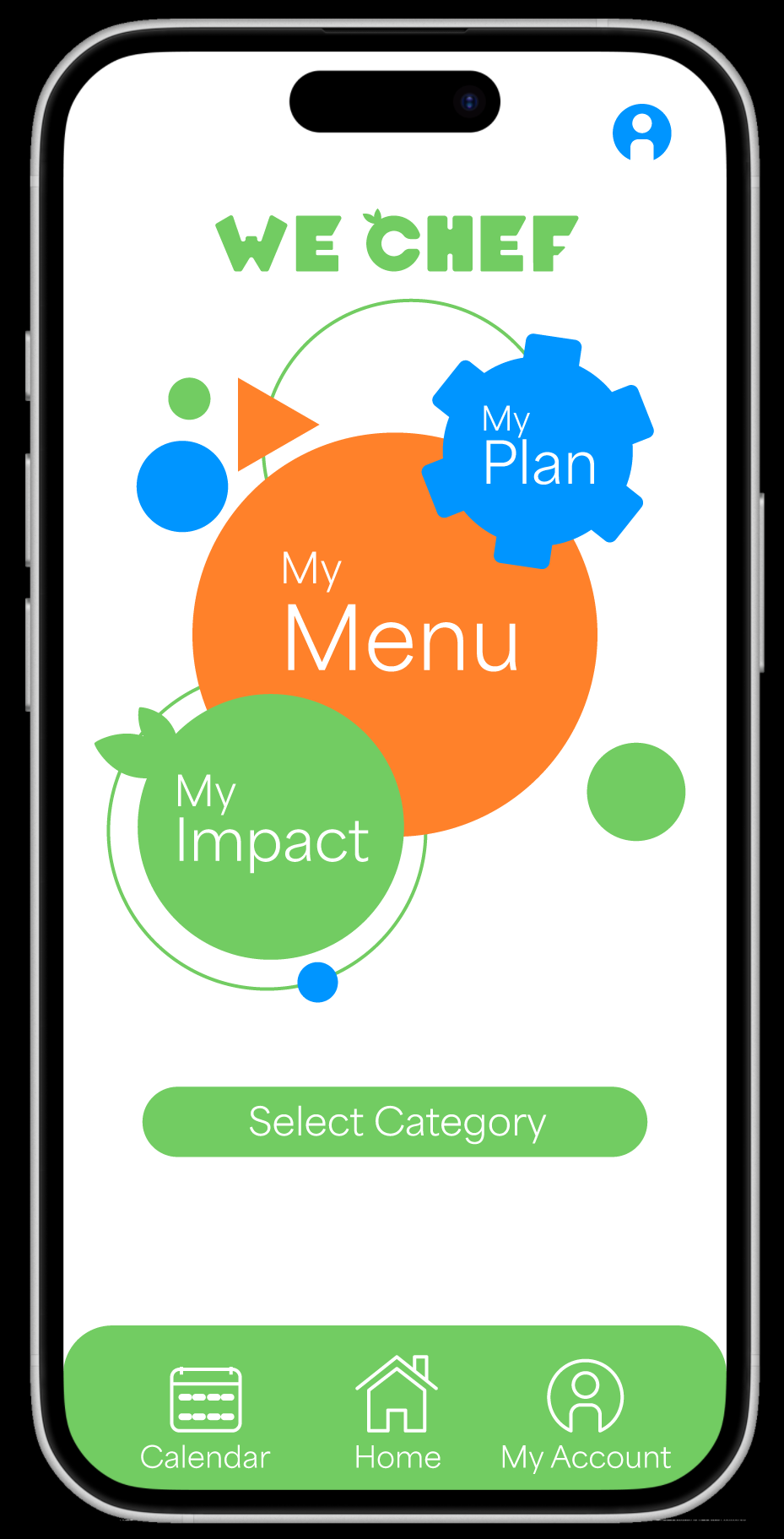
Project Scope
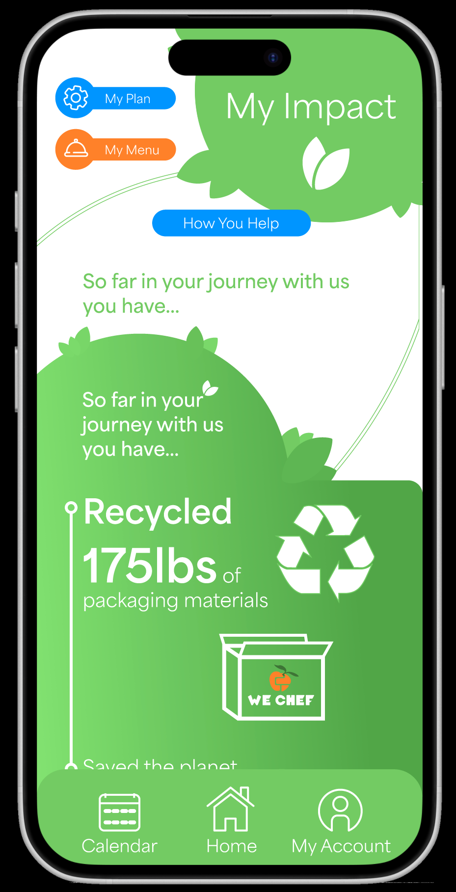
The WeChef branding project is directed to creating a future-focused, cultural learning environment surroundng the subscription based meal-kit buisness model. Emphsizing the WeChef’s sustanability and environmental efforts catalyzes renewed subscriptions by offering the brand as the most cost and carbon footprint reducting option for dining.
Year: 2024
Development Time: 4 weeks
Deliverables:
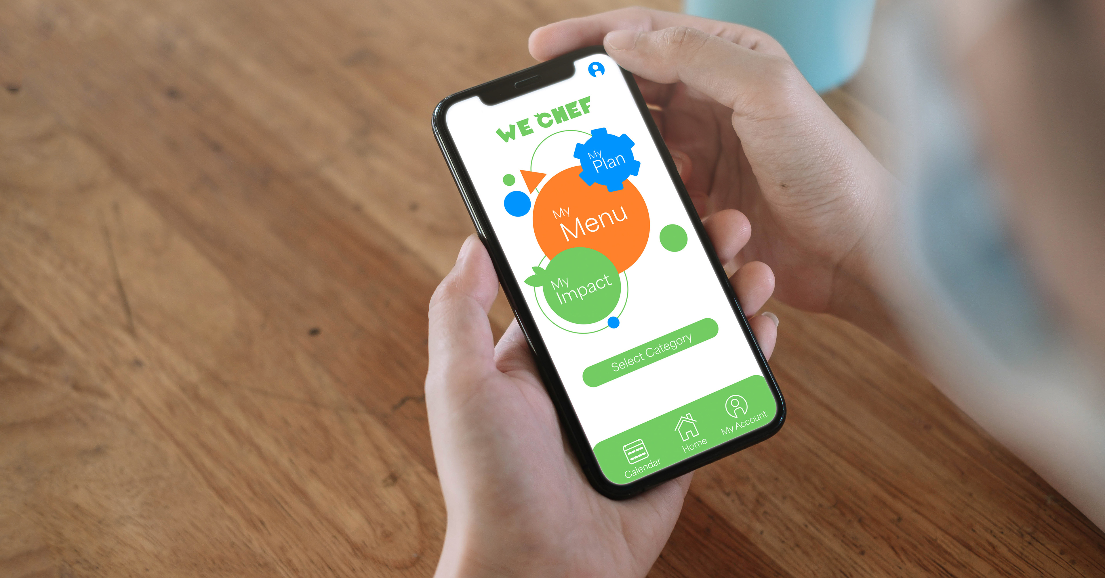
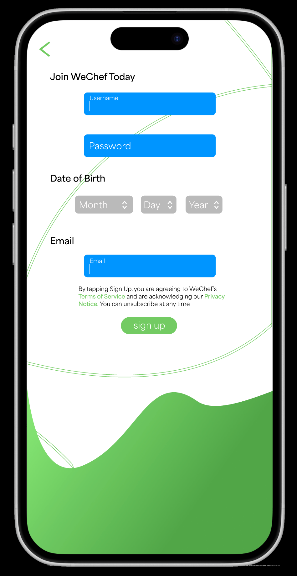
- Mobile Application - Business System
- Social Media Accounts - Meal Cards

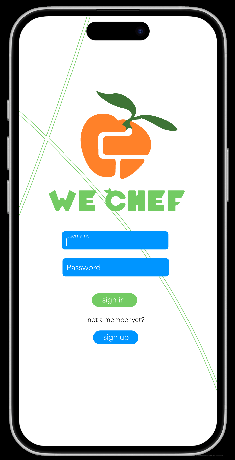


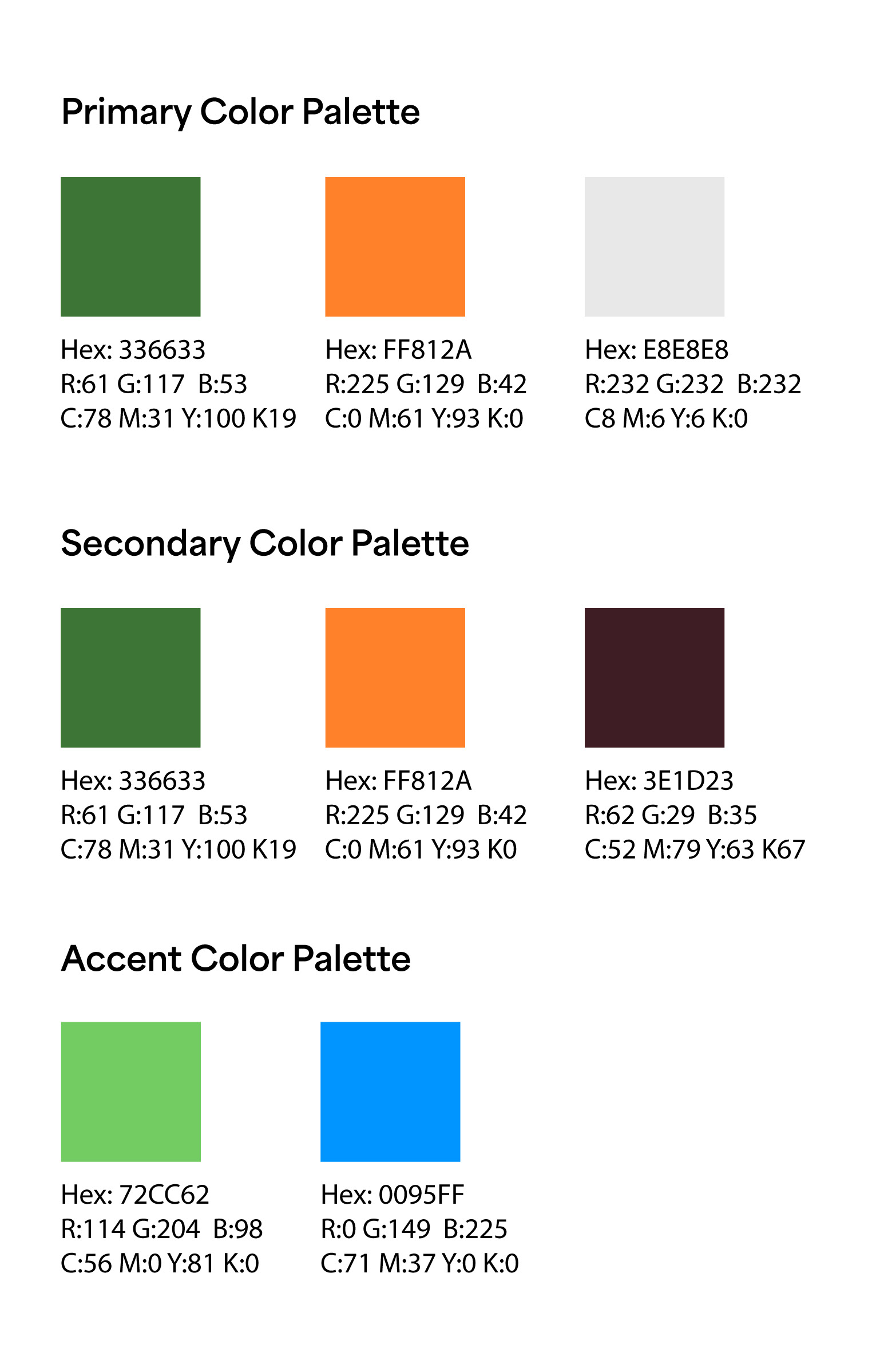
Logo and Color Guidelines
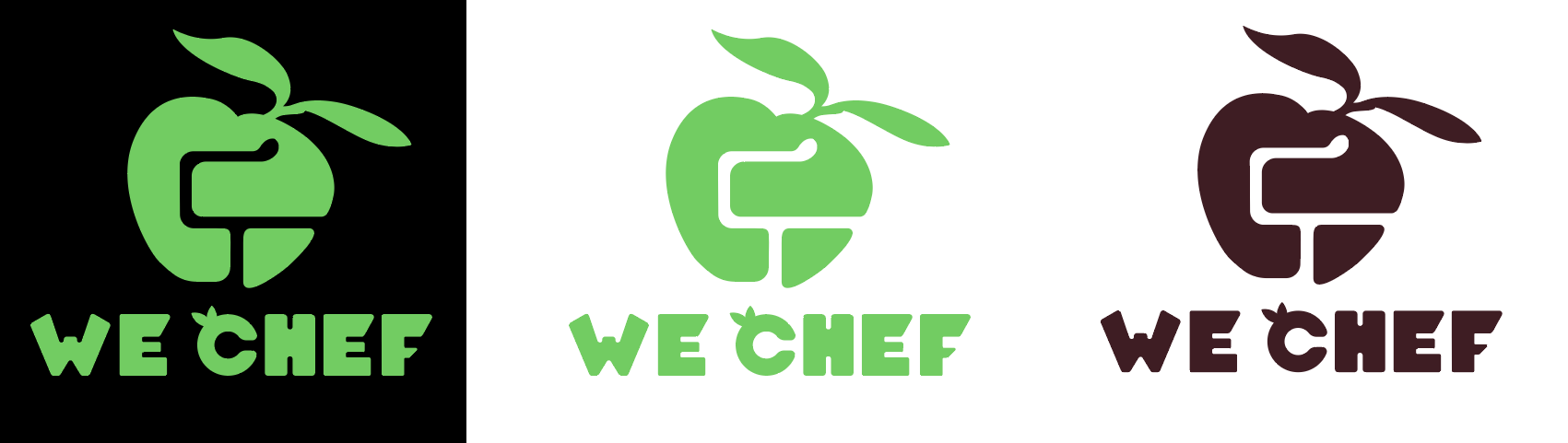
The full color primary logomark represents the primary identity of
the business and should be used whenever possible.
On a darker background the logomark can be reversed out as
shown below if needed.
The alternate colorway for the logo above is to be used
on backgrounds which clash with the primary orange
color of the primary mark. Below are the hexcodes of
each color palette.
Business System Items
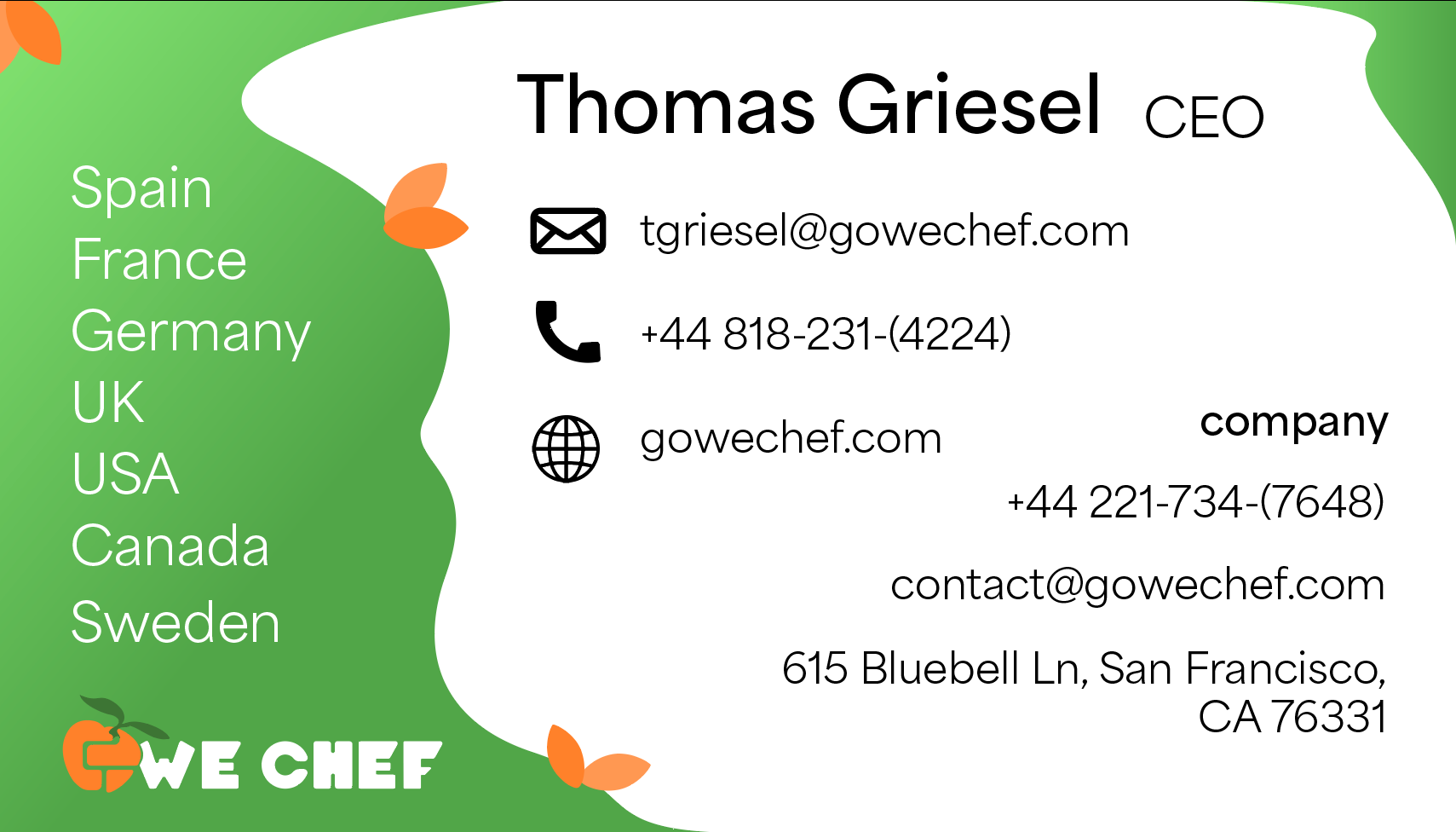
Business Cards
The business cards utilize the primary logomark and the smallest available margins and sizing for the logotype.
Utilizes icons to save space and make for quicker more intuitive legibility.
Use of semibold weight for name and “company” information section title to accentuate sections difference.

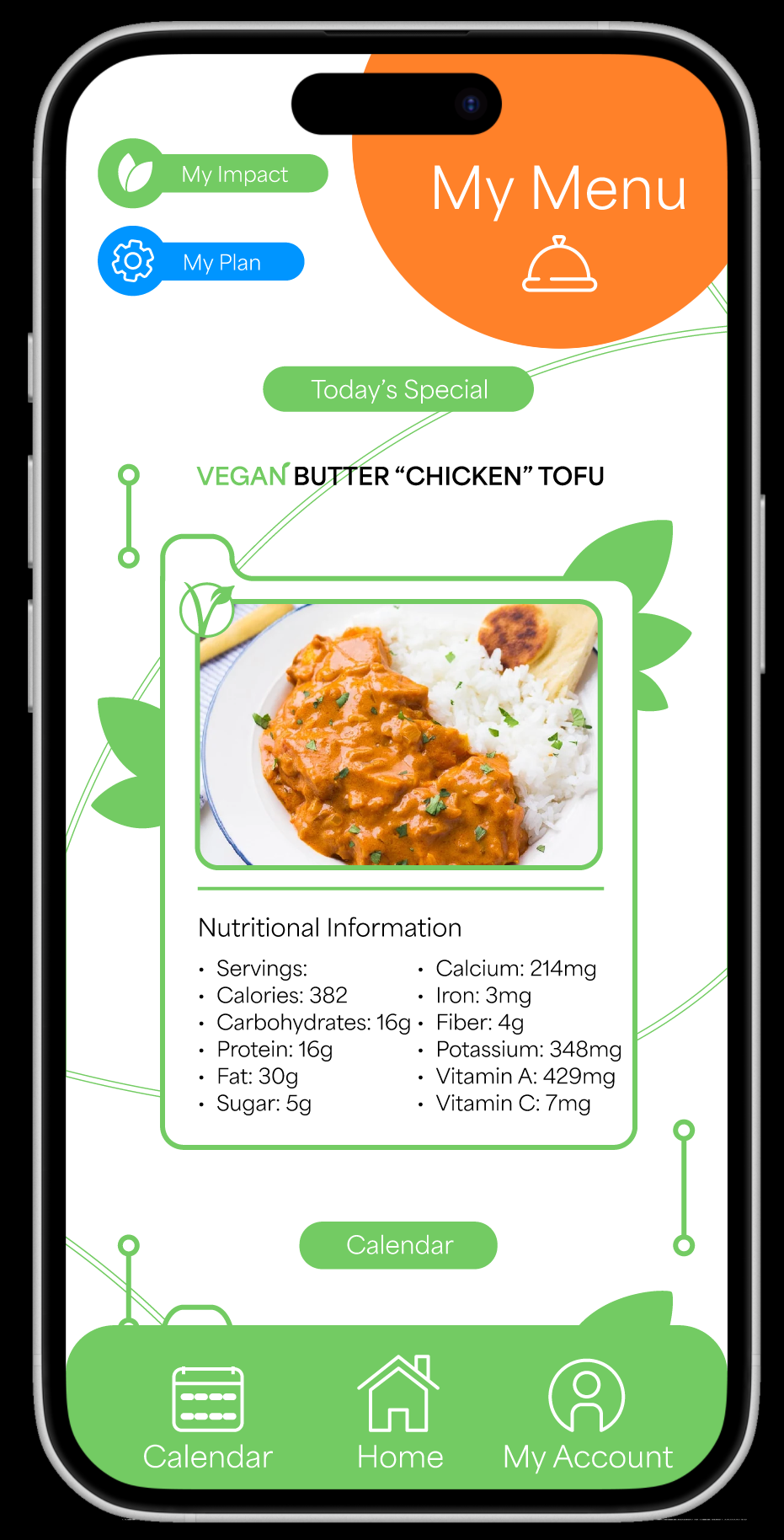
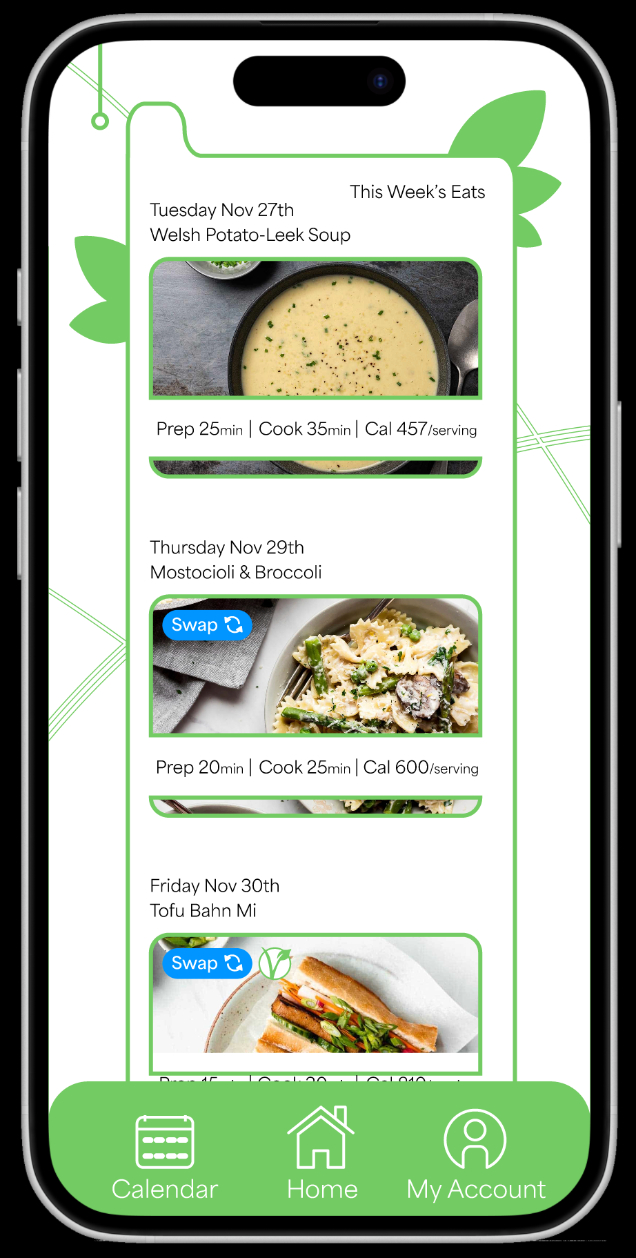
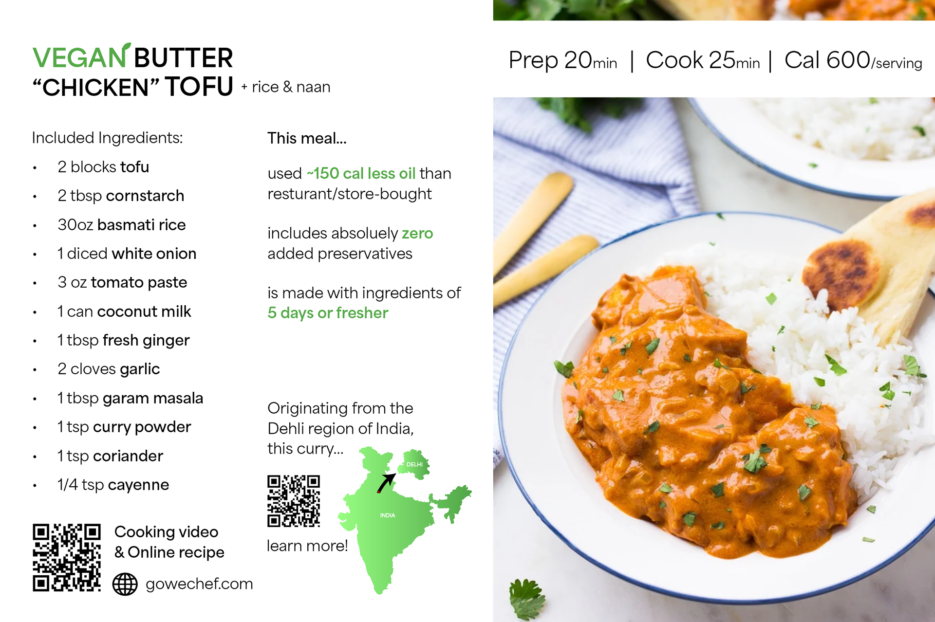
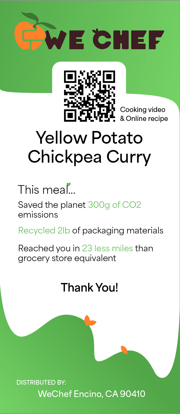
Recipe Cards
Recipe cards feature the most complex arrangement of graphical and text elements. Using alignment and semibold accent type the cards are able to pack a lot of critical information into a small space.

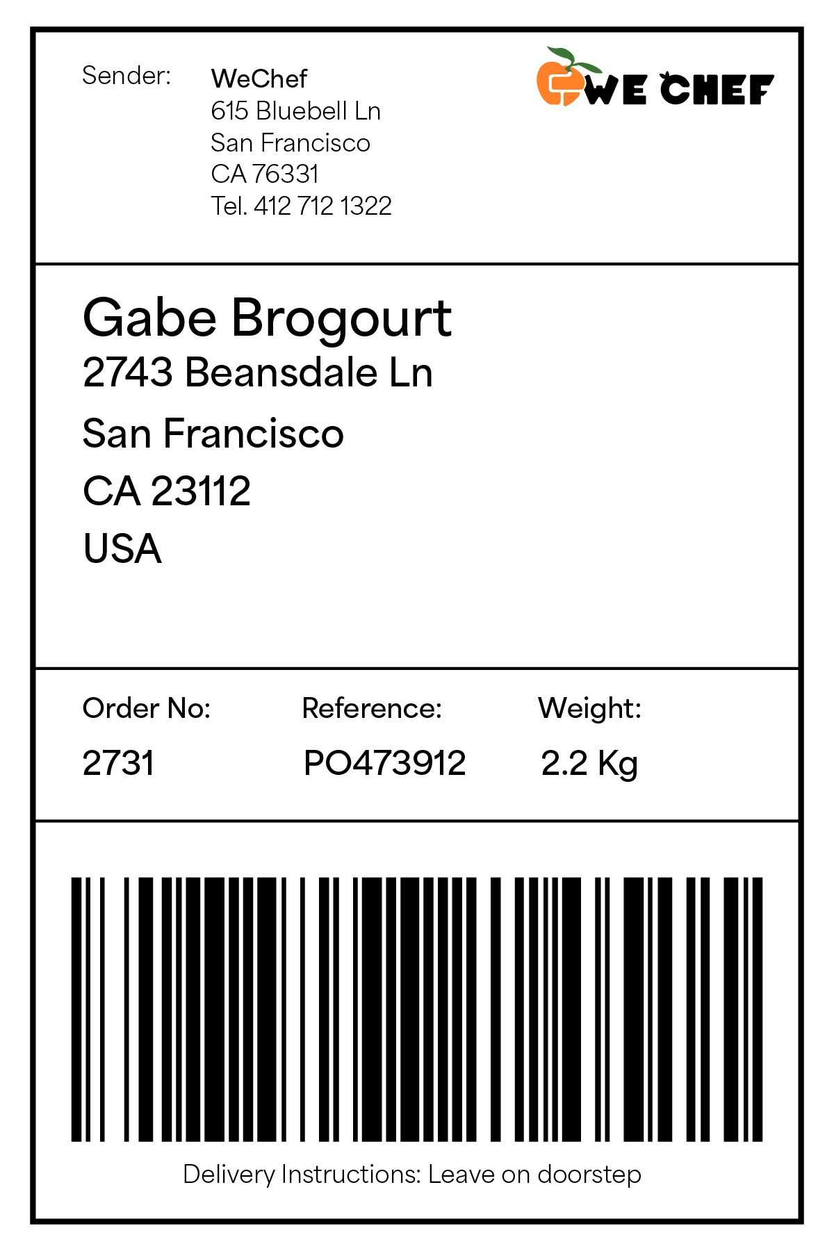
Shipping Labels
Shipping labels utilize QR code. Type is highlighted using semibold weight accent colors as well as reversed white on gradient text.
Envelope
Envelopes use minimal design elements other than primary logomark full color and icon to notate location.
The envelope uses a reversed out silhouette of the logo icon and is the only use of this reverse.

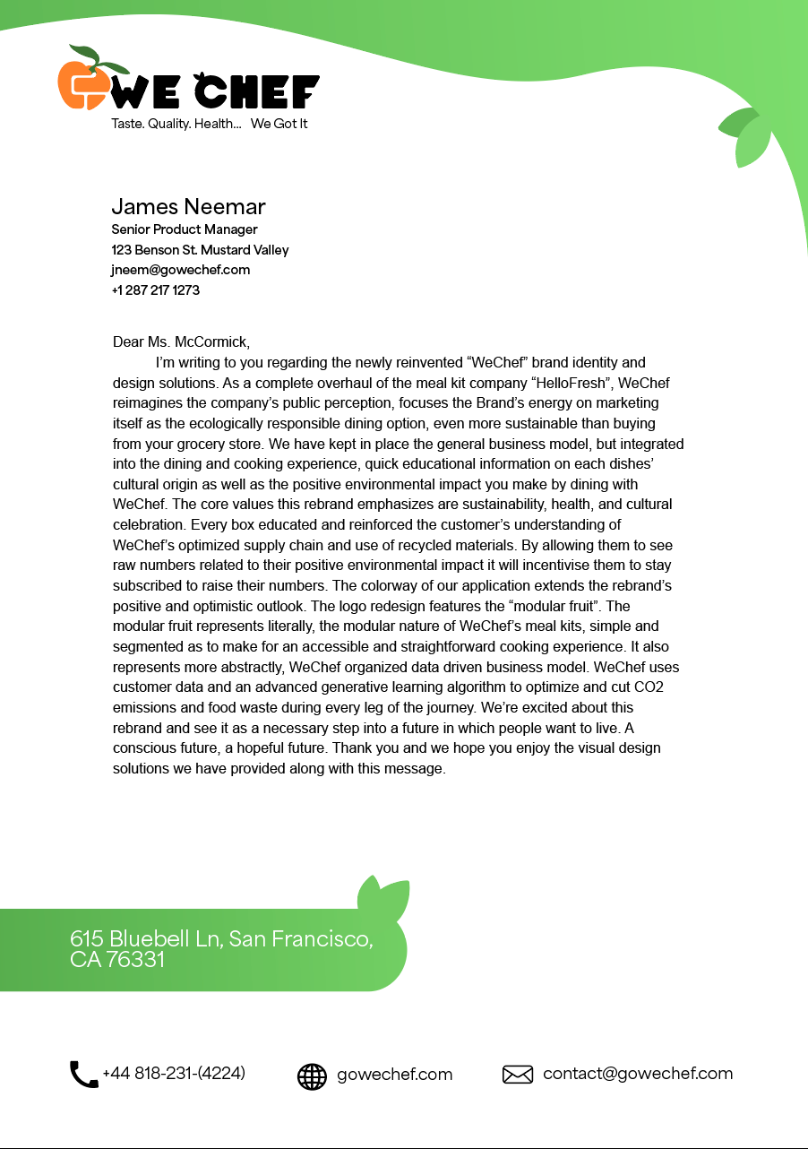
Letterhead
Letterhead utilizes alignment of and icons to organize and differentiate the personal vs company information. The light gradient and leaves graphic elements accentaute and disperse the brand identity as being healthy and eco-concious.
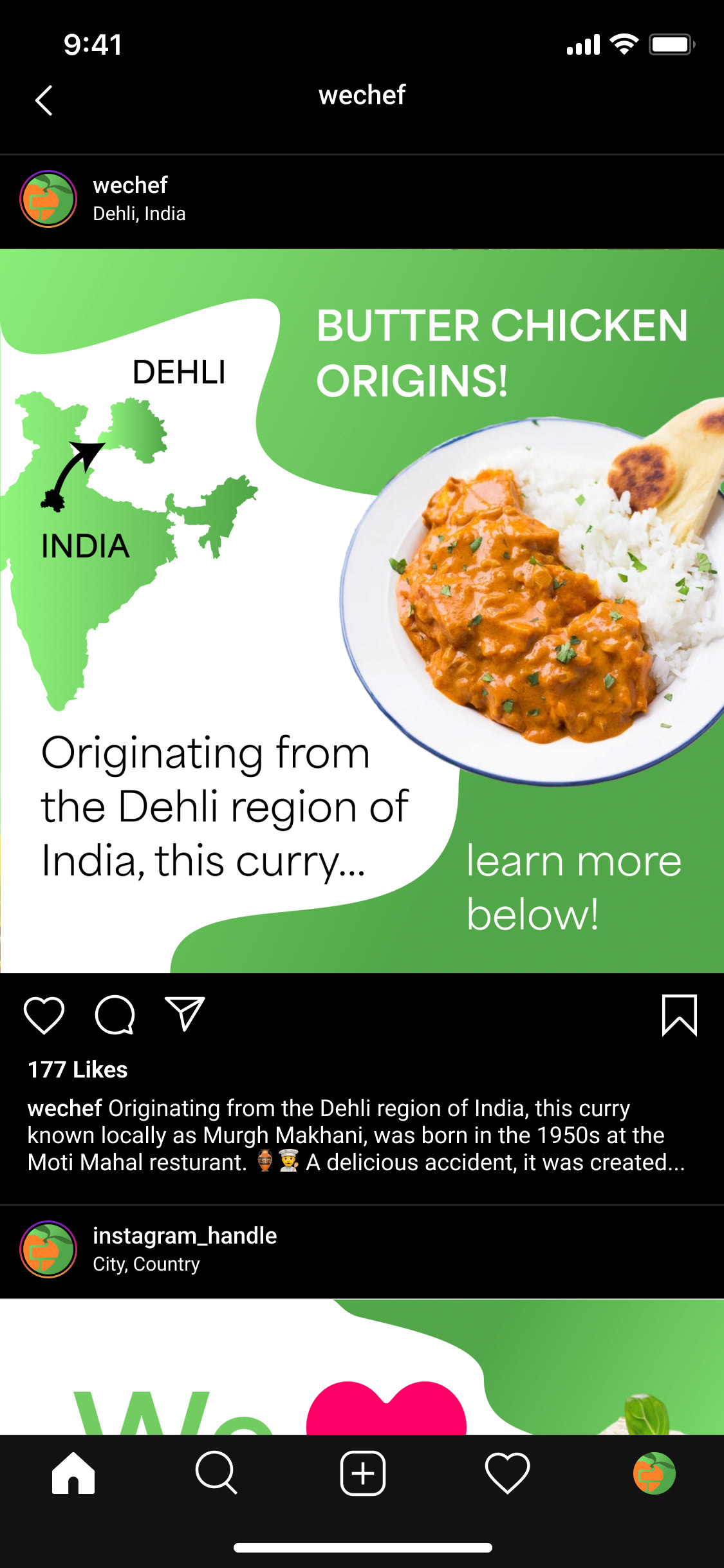
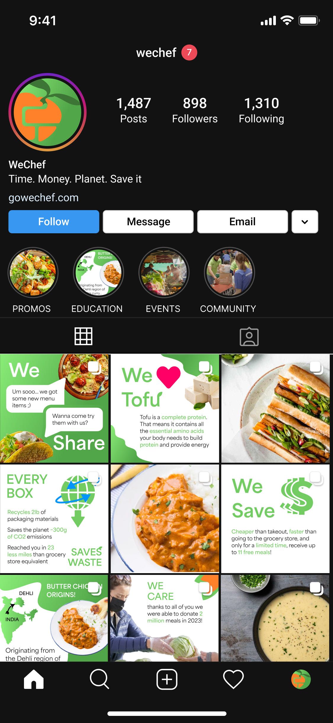
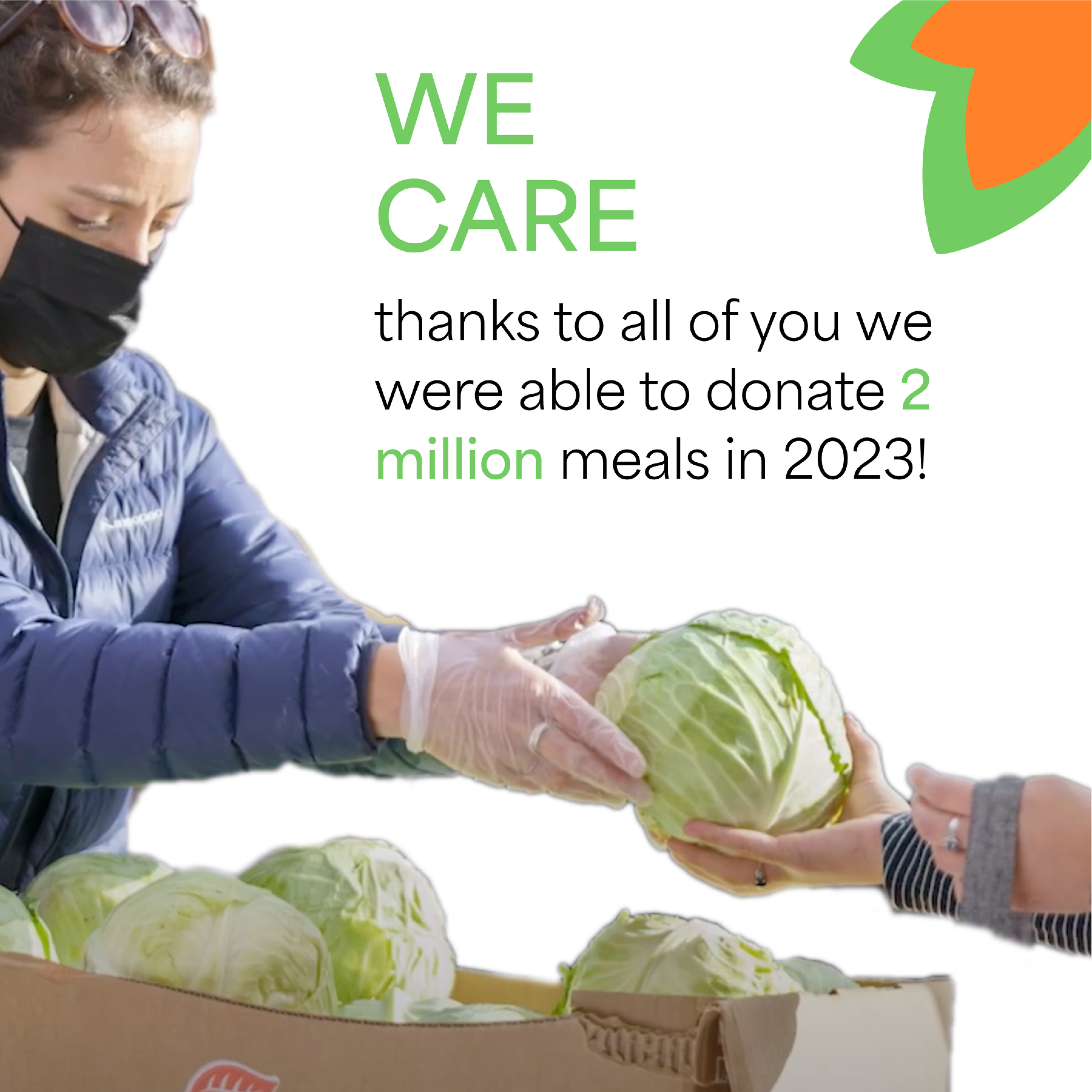
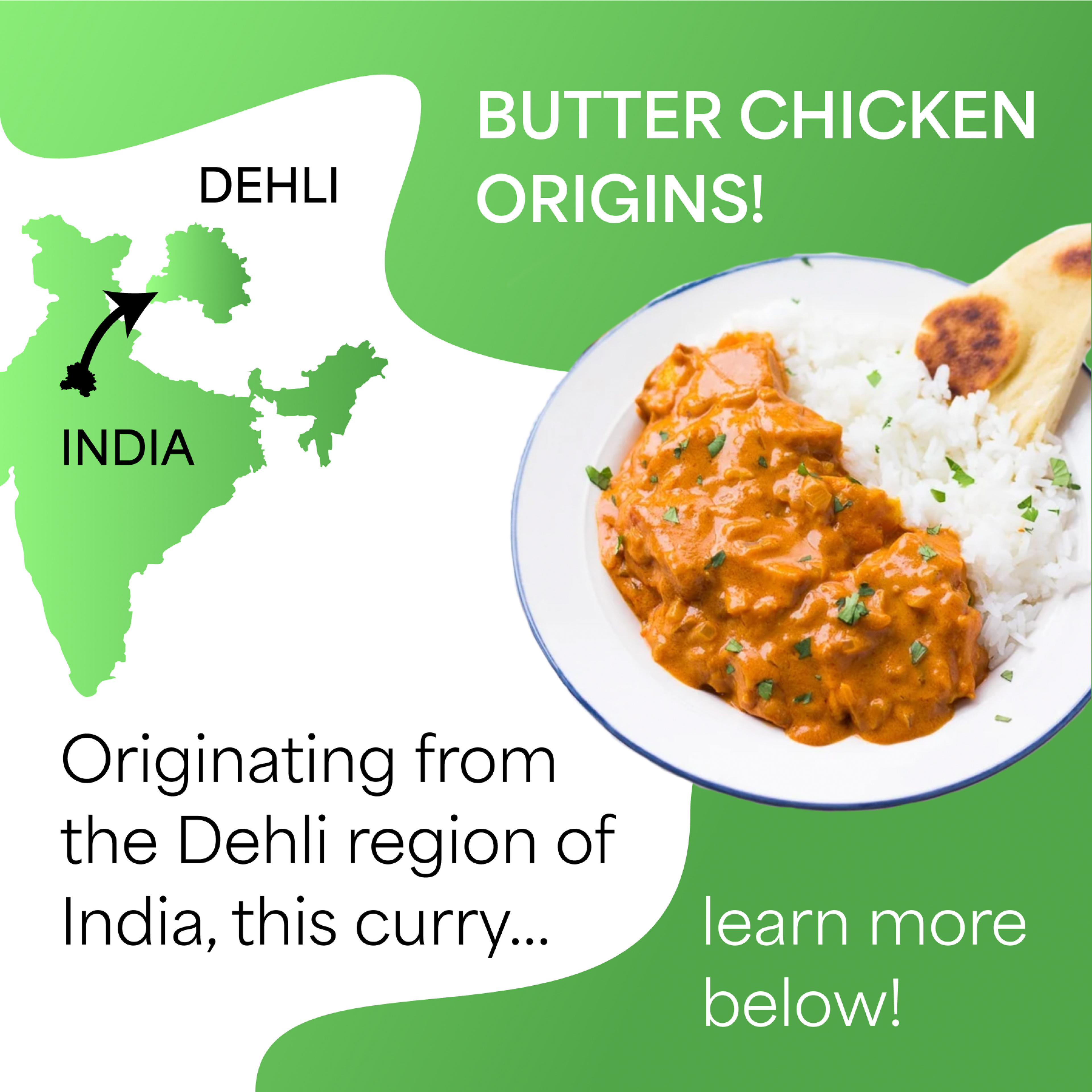
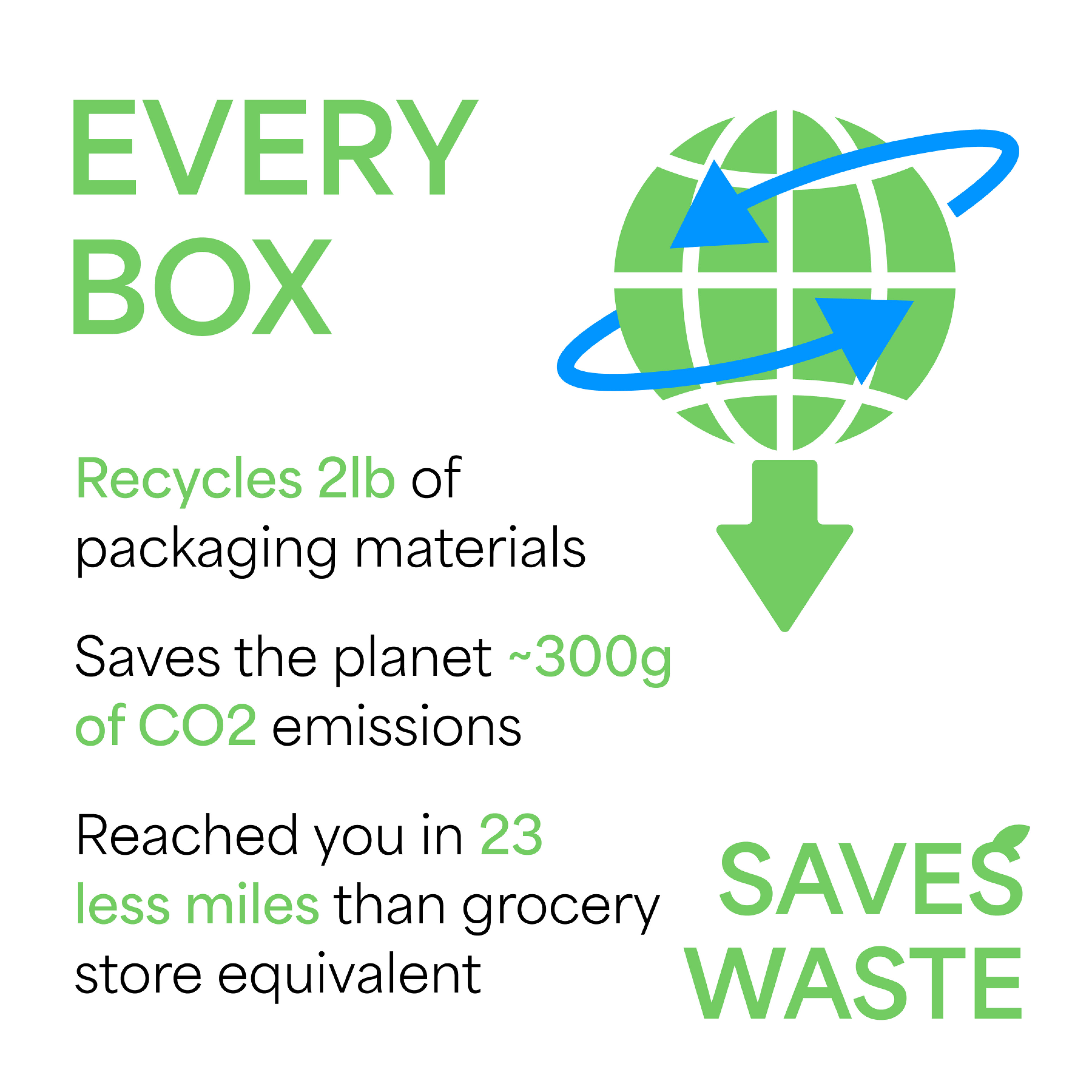
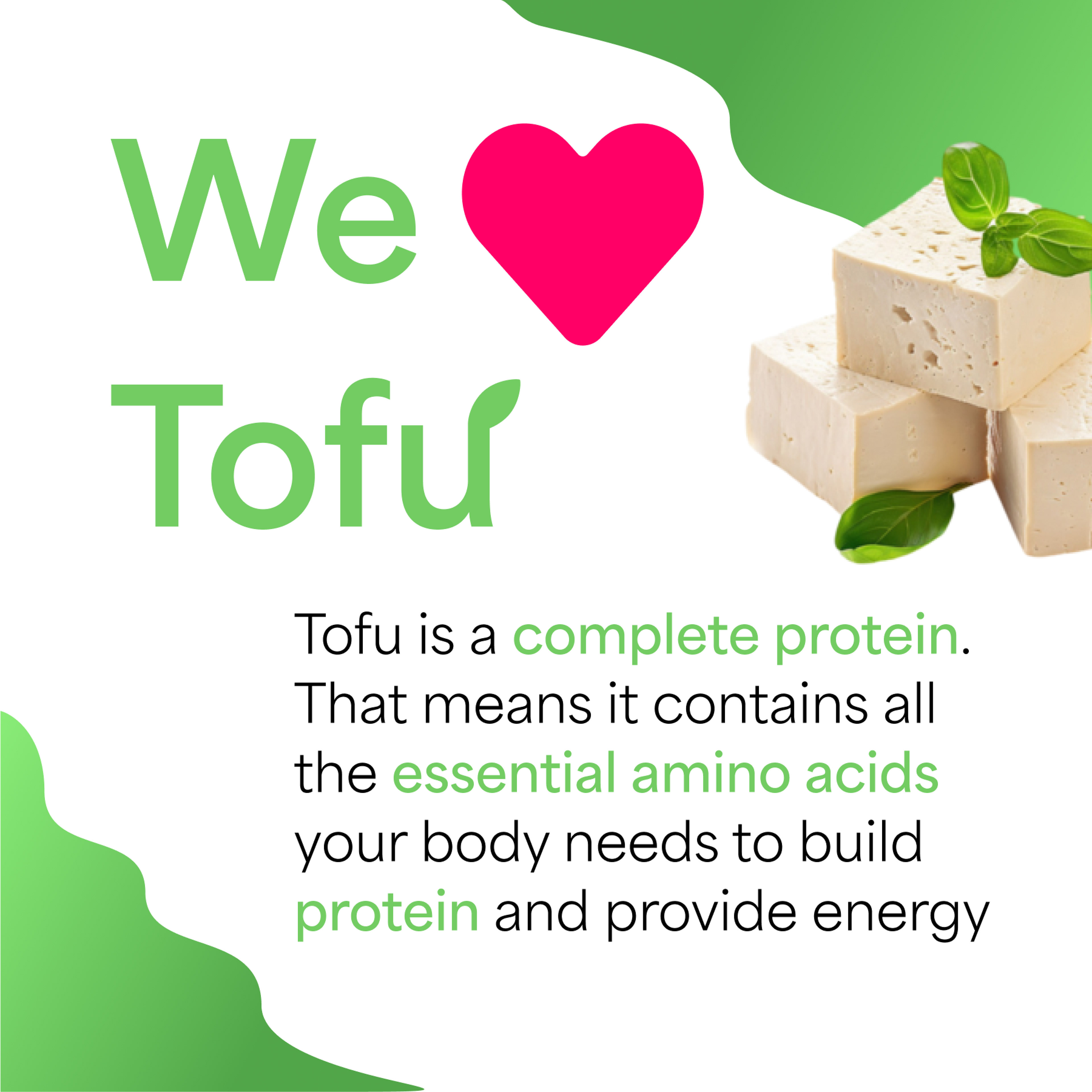
Social Media
The Social media page utilizes high quality images and semibold font weight heavily in order to make designs pop and get small bursts of information accross in the quick-paced social media square format.

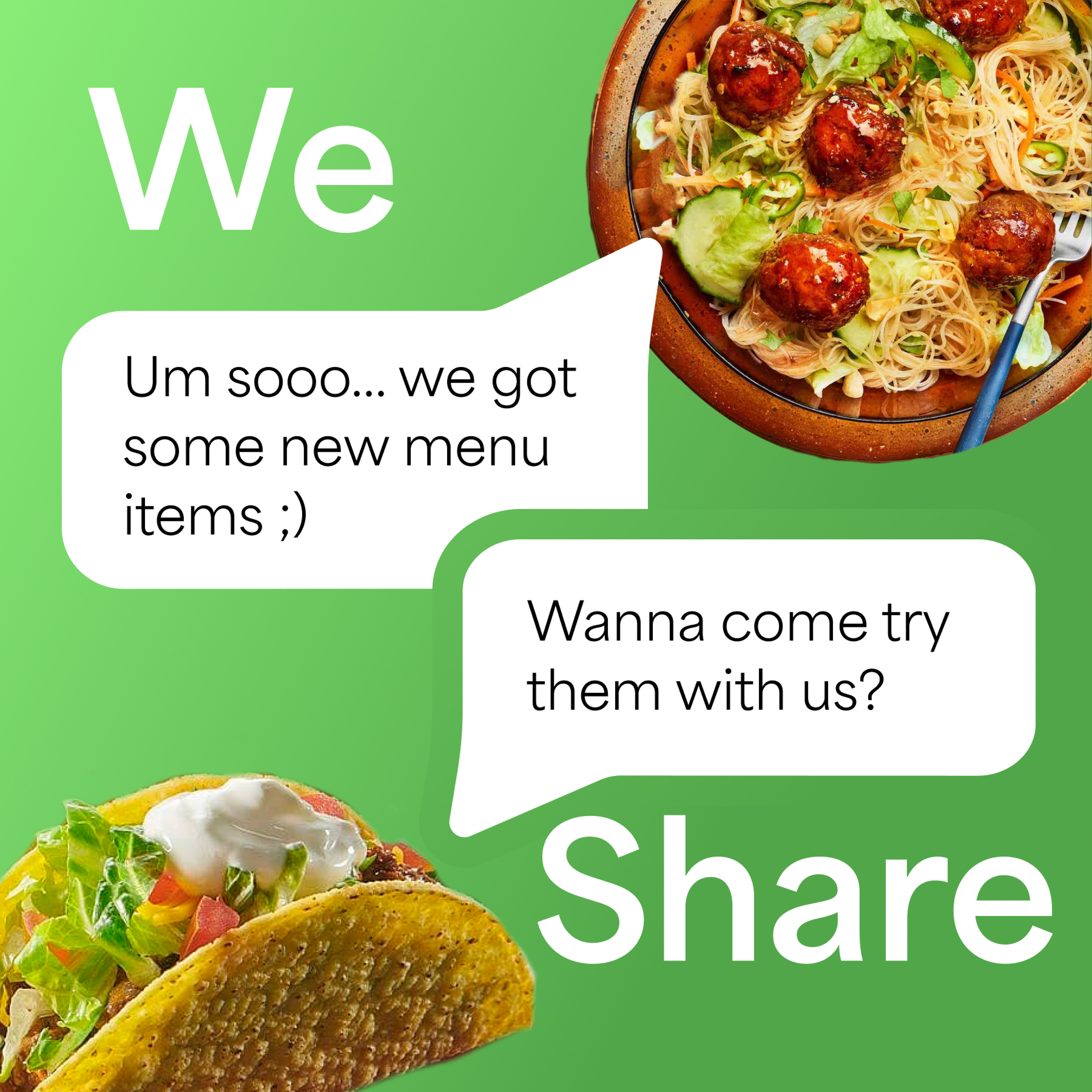
Food and other photography should always be higher than 300PPI to preserve brand and food identity’s high standards for quality.
Icons should be used at no larger than 0.25inches in width and no other color than black.
Icons can and should be used in place of common forms of communication, information on location, and commonly recognizable food augmentations/notations.