Carfax Redesign
Introduction
Project Scope
Carfax is one of the premier used car sales apps, operating also as a vehicle data reporting service. Carfax reports are used by various other used car apps and are an industry standard of used vehicle condition reporting. The app’s main feature is allowing a user to find a used car. Users get there by first, filtering results of all used cars, then scrolling through each result, comparing results directly, and then contacting their chosen car’s seller.
Year: 2024
Development Time: 4 weeks
Deliverables:
- Mobile Application
- Research & Competitor Analysis
Task Flow


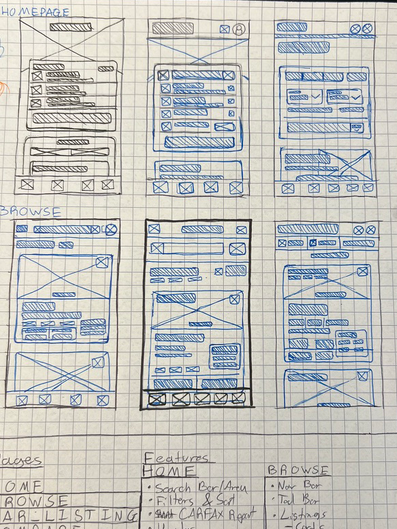
Sketches & Wireframes
Layout sketches displaying each screen design as wireframes.


Secondary Round Designs


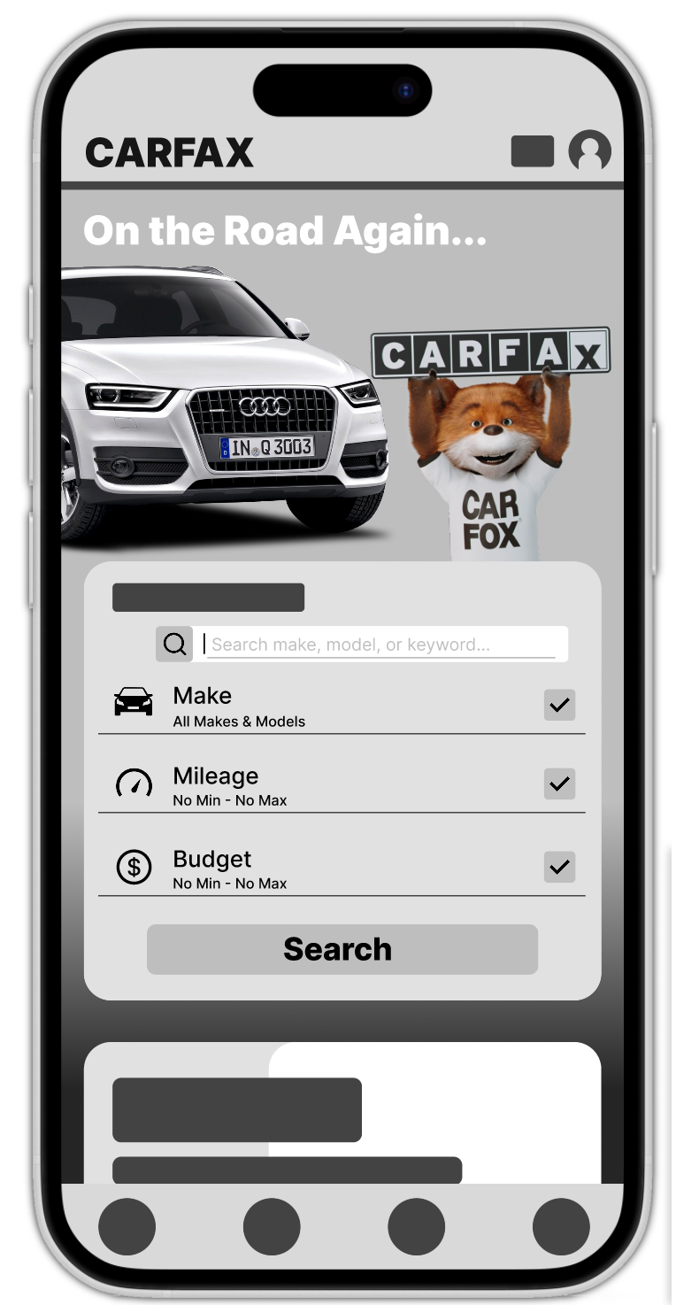
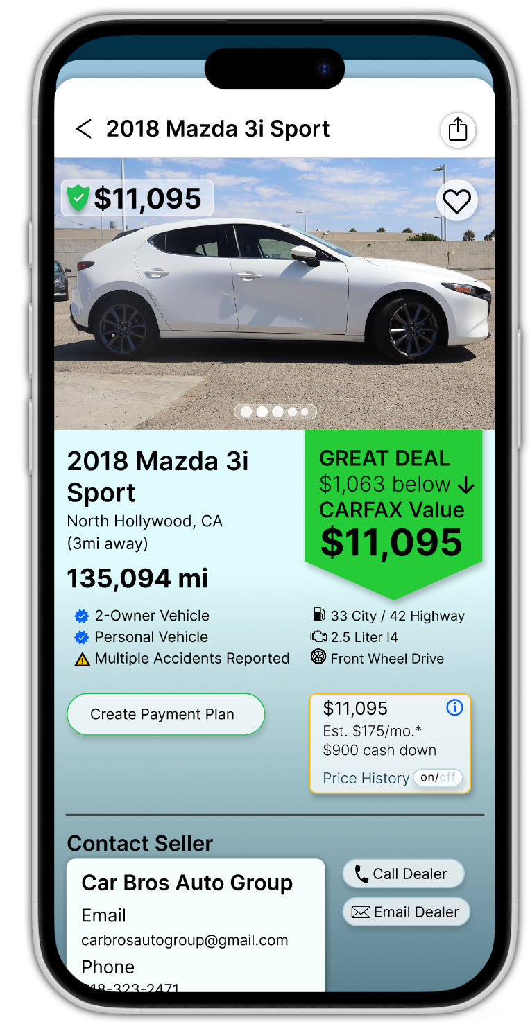
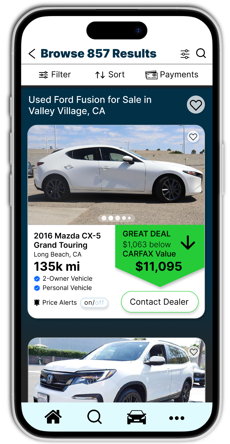
Final Screen Designs


Research
Carfax is one of the premier used car sales apps, operating also as a vehicle data reporting service. Carfax reports are used by various other used car apps and are an industry standard of used vehicle condition reporting. The app’s main feature is allowing a user to find a used car. Users get there by first, filtering results of all used cars, then scrolling through each result, comparing results directly, and then contacting their chosen car’s seller.
The process by which the user is led to find their car of choice is very de-optimized. No page has a top navigation bar, making navigating pages feel confusing and almost like you can’t find your way back at times. The filters section lacks the ability to choose more than one make and model at a time, this isn’t optimal for searching as most users have multiple car types and brands they trust and more often would like to simply eliminate the ones which they don’t trust.
It would be helpful to display the search criteria you’re using while scrolling through searches, or even while making a search, it would also incentivise using the “save search” feature. The automatic way which the app sorts the cars is very poor, the ability to sort by proximity is hidden at the bottom of a drop down menu. The home page is also very unwieldy. The lack of a nav bar or anything at the top of the screen makes the app look unpolished. The section division is also pub par. Starting with car search is good, adding a search bar would help rather than just having filters. Combining the saved searches into the search section is necessary. It currently sits well below the search section
disregarded and unfindable by anyone besides the developers. The “explore body styles” section is not necessary and should be removed. It functions as a second, less specific and less customizable search section. The Carfax report section/button should be more apparent on the app. Its section card is small and features no description of the service offered even though it is the feature which sets Carfax apart from the competition.
The tool bar and nav bars on this app are extremely poor. When viewing an individual car listing page, the tool and nav bars disappear. This should not happen. The car listing page is overall very poorly organized. Sections are not titled, display duplicate information, and have crucial information such as seller information near the bottom or sandwiched between less important sections. This means the user has to constantly scroll up and down the page, to find the information they’re trying to access. A scrollbar and sections titled on the right as small labels on the scrollbar would benefit the user experience by speeding up the process of accessing and re-finding information about the cars. On the car browsing page, your exact search, filter and sorting criteria should all be displayed at the top of the page. Possibly even recent and saved searches. Currently the top of the page only has a new search button.
The design of the app is very minimalist in the way that it all looks like a basic template website. The perfectly square corners on all buttons and sections display a lack of care about the app’s visual aesthetics. Pages, buttons, headers, etc. all feel extremely simple and without thought behind
user experience. The lack of nav bar on any page, lack of any color way for the app besides black and grey, and the homescreen image make the app less accessible. On the individual car listing pages, the car photos are all awkwardly cut off too short, almost never displaying a full view of the vehicle. Sections on these pages have zero contrast, making the search of information on a vehicle unenjoyable and difficult.